BroadJump requires the following
information for branding the VTI 2.0 product:
§
Splash screen bitmap
§
Shutdown screen bitmap
§
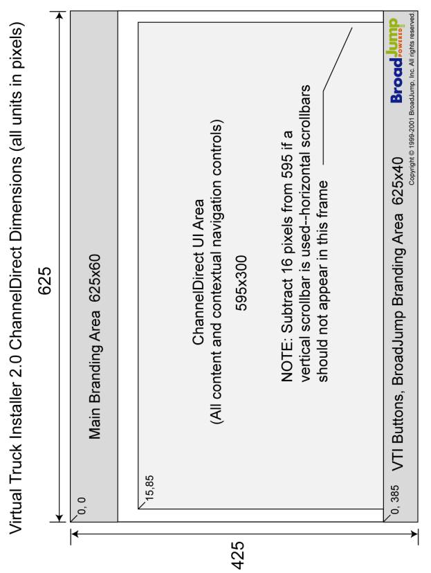
Default layout
§
Rich Help layout
§
About… screen bitmap
§
Custom buttons (if applicable)
§
ChannelDirect content (if applicable)
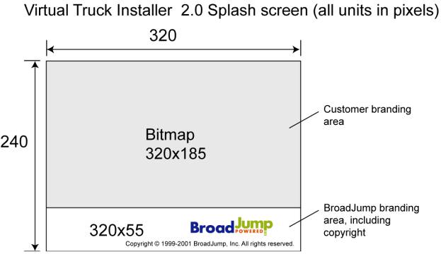
Splash Screen Specifications:
An example of the splash screen
graphic, using the BroadJump logo, is shown below for illustrative
purposes. Graphic size requirements are
also displayed.
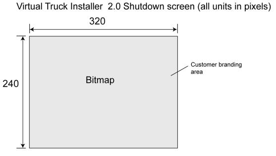
Shutdown Screen Specifications:
The shutdown screen is similar to the
Splash screen in that it is displayed while the program is doing other
operations. NOTE: Somewhere on the bitmap should be text stating that a
shutdown is in progress.
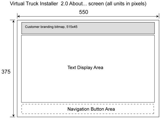
About… Screen Specifications:
The About… screen will display legal
and copyright information in series of simple scrolling text fields. The fields
are navigated by a set of buttons on the lower edge of the screen (i.e.,
"Legal", "Copyright", etc.). A customer branding graphic
will be displayed at the top of the screen, using the dimensions below.
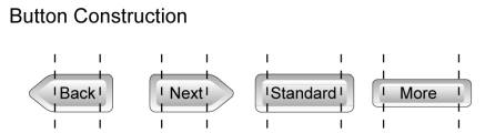
Custom
Button Requirements:
- Button must be designed to work in three parts.
{Left Cap, Center, Right Cap}.
- Avoid lines that are vertical and spaced in
specific locations on the centerpiece.
- Avoid horizontal "lines", unless they
are set to: Stroke > hairline. (It is best to avoid "lines"
altogether. Use a "fill"
whenever possible. You can select
lines and convert them to fills.
It is probably best to convert all lines to fills.
- Avoid button design that would require vertical
resizing when it is horizontally resized.
- "Highlight" and "focus"
images should be made with fills.
- Avoid horizontal gradients (gradients that run
left to right), unless you want gradient to stretch on resizing. Vertical
(gradients from top to bottom, and vice versa) gradients are fine.
- Avoid radial gradients, unless you want gradient
to stretch on resizing.
1.1
Skinned Button Styles (Level 2)
Customization
levels for Default and Rich Help Area Layout
There are
three levels of skinning available for VTI 2.0:
- Level 1: New background graphic only (customer branding).
Buttons, controls, animations, layout, Help files, and UI text are same as
Generic VTI 2.0.
Requires:
Vector artwork (Illustrator, Flash, or Freehand) from customer for branding and
any art direction/specification files.
- Level 2: New background graphic, customer-specific UI
strings (edited XML files), and re-skinned buttons. Layout, controls,
animations, and Help files are same as Generic VTI 2.0.
Requires:
Same as Level 1, plus any edit requirements for UI strings, spec for button
look & feel.
- Level 3: Same as Level 2, with new/edited controls,
animations, and Help files.
Requires:
Same as Level 2, plus spec for controls and animations look & feel, Help
content.
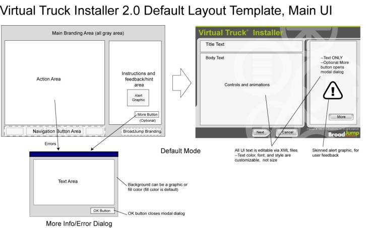
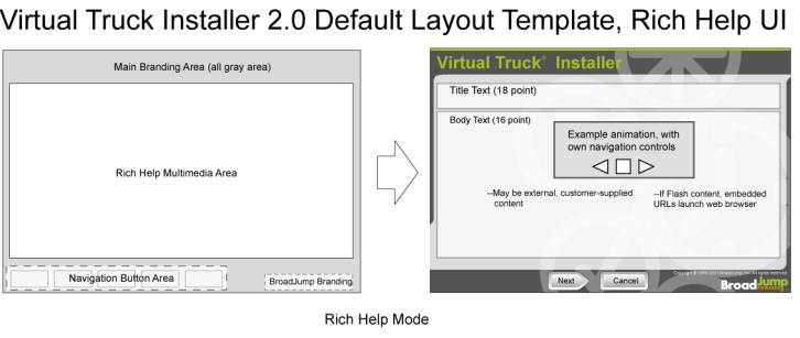
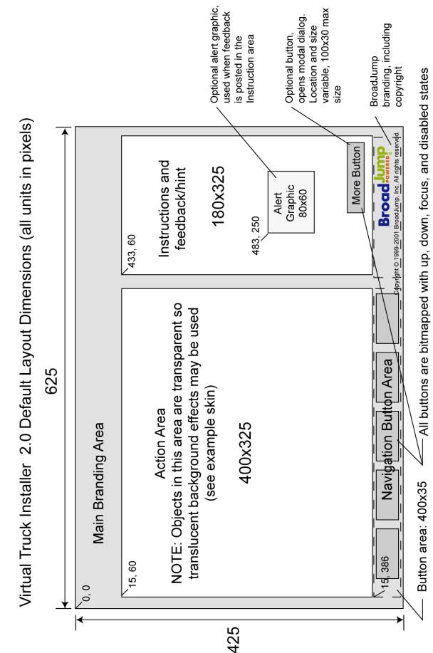
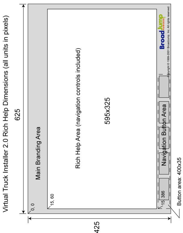
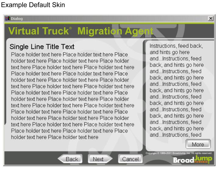
Examples
of the Default Layout Template and the Help Area Layout are detailed below.
1. Options
·
Audio overlay: Rich Help may
have synch audio (narration, music) added to any screen or animation. Expensive
implications--professional narration/musicians, sound studio, quality
compression of audio--but very user friendly for things like Help files. At
least a month for script development, asset production, and integration.